In this level 0 post, we take a look at one of the contributions of recent Nobel prize-winner Sir Roger Penrose. In particular, we’ll discuss the famous spacetime diagrams which bear his name.
Introduction
Earlier this week, the Nobel prize in physics was awarded jointly to Sir Roger Penrose, Reinhard Genzel, and Andrea Ghez, all for contributions to physics regarding black holes. Genzel and Ghez split half of the prize for their discovery of the supermassive black hole at the center of our galaxy, while Penrose was awarded the other half for establishing that the theory of General Relativity (GR) allows for the formation of black holes. It has long been known that black holes were valid “solutions” to the equations of GR, in fact Karl Schwarzschild found a black hole solution just months after Einstein published his famous theory, making it the first known solution after empty, flat spacetime (which is the subject of Special Relativity). Penrose’s contribution was to show that GR predicted that large amounts of matter could collapse into a black hole.
In light of this award, I would like to talk about another, related contribution of Penrose: the so-called Penrose diagram. A Penrose diagram is a spacetime diagram which captures some essential features of a particular spacetime. In particular, it sheds light on the causal structure of a spacetime. But that’s a technical term, so let’s unpack it. When we talk about causality in physics, we mean cause and effect. As physicists, we want to know what causes certain phenomena to happen. For example, if someone accused you of stealing a bagel from a coffeeshop in Atlanta, but at the time you were on a plane to Des Moines, you have a great alibi because there’s no way you could have taken the bagel from a plane. There was a point in time at which, even if you traveled at the fastest possible speed, the speed of light, you still wouldn’t have been able to go from the plane to the coffee shop to steal the bagel. In physics terms, you were causally disconnected from the event. Two points in spacetime (that is, a point in space at a particular time) are causally connected if you can get from one to the other without going faster than lightspeed. So the causal structure of a spacetime tells you which points are causally connected.
Penrose Diagrams for Beginners
Let’s take a look at one of the simplest spacetimes and its Penrose diagram to see how it works. By far the simplest and most intuitive spacetime is flat space. In flat space, you get all the familiar rules of geometry that you are used to, Pythagoras’ theorem, the angles in a triangle add to 180 degrees and so forth. There is one minor problem before we can draw the diagram, however: flat space is infinite and our paper is not. When coming up with his diagrams, Penrose realized that you can represent an infinite space in a finite drawing by being a little clever. As an example, consider the tangent function below:

As you can see, this function outputs all the numbers from 


Flat Space
The Penrose diagram for flat space looks like this:
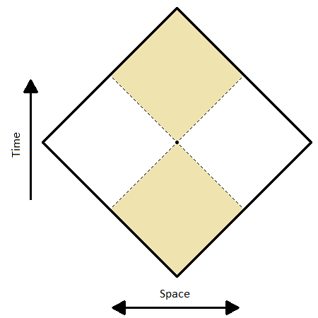
On this diagram, and all Penrose diagrams, light travels at 45 degree angles. In order for a person in this spacetime to reach the bold edges, it would take an infinite amount of time and distance. Anything with mass (so it travels at less than lightspeed) will wind up approaching the upper corner of the diagram in the far future, and will have started from the lower corner in the far past. Only light can reach the diagonal boundaries. You will also notice that I have highlighted some areas of the spacetime in yellow. All the points in yellow are causally connected to the point in the center of the diagram. The dashed lines going through the center represent the light rays that would pass through that point; we call this the lightcone. Points inside the lightcone (yellow) are causally connected to the center point, while those outside (white) are causally disconnected to the center point. The lightcone is thus the boundary between those points which have influence on the center point and those without influence. You might wonder why there is only one dimension of space in the diagram (the other is time). In this particular example it isn’t too important to think about the other two dimensions of space, because flat space is so simple, but we will tackle this problem in the next example.
de Sitter
Let’s look at a slightly more complicated spacetime: de Sitter. This spacetime is near and dear to my heart, as most of my research takes place in this spacetime. de Sitter is the spacetime with only dark energy. This means that as time goes along, space expands exponentially. Our universe, being a bit over 2/3 dark energy, is approximately de Sitter, though our expansion rate is small enough that the effects are only visible on at least intergalactic scales. The Penrose diagram for de Sitter space looks like this:
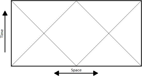
This is a rectangle, but it should really be thought of as a cylinder that has been cut down the side and flattened down. The left and right edges should be thought of as the same, so going through one brings you out the other side, like in Pac-Man or Asteroids (this does not apply to the top and bottom, however). Every horizontal slice of this diagram should then be thought of as a circle in 1+1 dimensions, a sphere in 2+1 dimensions, and a hypersphere in 3+1 dimensions (don’t ask me how to picture that though). So even though this is a 2D drawing, it can represent de Sitter in any number of dimensions (usually in higher than 1+1 dimensions, we cut the diagram in half and draw it as a square).
de Sitter has a few interesting properties that we can see right off the bat. For one, a point in the far past (the lower boundary) can influence any point in the far future, like in flat space. However, it can’t influence every point in spacetime, which was not the case in flat space. This makes sense because the expansion of space increases the distance light would have to travel in order to make it to its destination as it travels, and for many points in de Sitter, there is so much expansion that the light never reaches those points. Likewise, a point in the far future (upper boundary) could have been influenced by any point in the far past, but not by any point in de Sitter. This particular point is very important in the physics of de Sitter spacetime. The boundary between those points in and out of causal contact with the point in the far future is called the cosmological event horizon. Objects can cross over this horizon, and once they do, there is no way to bring them back. In this way, de Sitter is like an inverted black hole, where instead of a blackhole horizon surrounding a singularity, the horizon is surrounding us. And instead of objects tending to be sucked inward, they are pushed outward by the expansion of space between objects, in both cases thrown towards (and through) the horizon.


The last comment I will make about de Sitter is that there is a special region where an observer (say travelling along the central vertical line through spacetime) can send a signal and get a response (being in causal contact). Naturally, this region is determined by the overlap of the two yellow regions above. This is called the causal diamond, and you might recognize its shape:

It looks just like the Penrose diagram for flat space, and this region of spacetime has some similar properties to flat space that the full de Sitter spacetime does not. However, there is an important difference. Objects can reach the diagonal boundaries in finite time, and cross over them, which was not the case in flat space. These boundaries are not stand-ins for infinities, but rather for the horizons that define what it means for the central point to be in causal contact with another point. Other observers will have their own causal diamonds, which may or may not overlap with the one pictured above (see if you can find the only causal diamond that doesn’t overlap with the one shown).
Black Holes
Let’s shift to the reason Penrose was awarded the Nobel prize: black holes. There are different conceptions of black holes as history goes along, each with its own Penrose diagram, so we will follow the historical narrative, starting with Schwarzschild’s black hole solution to Einstein’s equations.
Eternal Black Holes
The Schwarzschild spacetime is an example of an eternal black hole, that is one that has always existed and will exist forever. It was never formed, but rather just is. It is the simplest black hole solution of Einstein’s equations in that it does not evolve in time. It has no electric charge, it does not rotate, it has no history of a core-collapse supernova. Its sole defining feature is its event horizon, the boundary separating two causally disconnected regions of spacetime. The Penrose diagram for an eternal black hole looks like this:
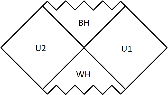
The squiggly lines at the top and bottom of the figure are representative of a gravitational singularity. Technically, there are a few different ways of drawing this diagram. This is the maximally-extended Penrose diagram. It is maximally extended because, through some mathematical tricks, the spacetime has been extended to include more than just the universe (U1) and the black hole (BH). The extension is made because without it, there are particle trajectories that cannot be followed infinitely far into the future, they just end. The lines separating the 4 regions are all event horizons. The bottom region is called a white hole because it is the time reversal of a black hole. Instead of swallowing anything nearby, it acts in the complete opposite way by just spitting matter out of itself. We can see that from the diagram because there is no way for anything in the universe to enter the white hole, but something in the white hole is able to enter the universe. There is no concrete evidence that white holes exist, but some have speculated that certain gamma ray bursts were produced by white holes, and even that the big bang could be caused by the formation of a white hole.
Finally, the region labelled U2 is another universe. It looks, for all intents and purposes, like the universe U1, in that far away from the black hole, the spacetime looks flat (that’s why it has that same diamond shape as the flat spacetime Penrose diagram). However, this complimentary universe lies inside the Schwarzschild radius of the black hole, inside the event horizon. Of course, that doesn’t mean that someone in U1 could access U2 — they are completely causally disconnected — but it is interesting to think about this separate universe.
Black Hole Formation
Penrose received the Nobel prize for showing that GR predicted the formation of black holes. These would be formed from some large object collapsing under its own gravity until it became so dense that it formed an event horizon. In our universe, the best candidates are stars: they are big and they sometimes go supernova and collapse into very dense objects. Not all stars collapse into black holes, some become neutron stars and some don’t form dense objects and instead spread their material across a large swath of space forming a nebula. Only very large stars have a chance at black hole formation, and it looks something like this:

The grey curve represents the radius of the star, so as time goes on (travelling upward in the diagram), the star collapses into a black hole. The black hole is formed right when the two dashed lines intersect the vertical border. The upper dashed line is the event horizon. Once you cross that line, you can no longer escape. Even if you were to travel at the speed of light (diagonally up and to the right), you could only reach the squiggly top border, which is the singularity inside the black hole.
The lower dashed line is the last light ray that could pass through the star without being sucked into the black hole. It would get there just in time to escape. If we could see this light ray, from afar, we would see it become stretched by the gravitational pull of the newly-formed black hole, losing more and more of its energy. This would cause the light to become redshifted, so that if it started as visible blue light, it would turn red, then infrared, having its wavelength stretched further and further. A similar effect happens in our own universe due to the expansion of space.
Unlike the eternal black hole, this diagram does not show a white hole or a complimentary universe. This isn’t because there definitely isn’t one, we just don’t know. No one has been able to come up with a formation mechanism for a white hole. In fact, no one has come up with an explicit mathematical solution to Einstein’s equations for the formation of a black hole. Penrose showed that it is a robust prediction of general relativity, but to explicitly solve Einstein’s equations, given some matter distribution, is incredibly difficult. Most work on these harder problems is done through approximations on a computer. And without the exact answer, we can’t know for sure that there is an extension of the solution that gives a white hole and complimentary universe.
Black Hole Evaporation
So far we have only considered classical objects, but to go further, we need to start thinking about quantum mechanics. When it comes to the quantum mechanics of black holes, we have to talk about Stephen Hawking. Many physicists expressed sadness that Hawking could not be awarded the Nobel for his work on black hole physics (it is not awarded posthumously), but his contributions are some of the most important. He and his collaborators gave such insight into the interplay between general relativity and quantum mechanics that it spawned entire fields of study. I would like to focus on how he realized that black holes do not endlessly consume, but must evaporate until nothing remains.
Black hole evaporation can be thought of as a thermal effect. Like anything at above absolute zero temperature, black holes radiate (this thermal radiation is how those no-contact thermometers work). This radiation decreases the energy of the black hole, and thus its mass. The rate at which the black hole radiates grows as the black hole shrinks until it finally bursts in a violent explosion. Hawking and James Hartle discovered that the radiation has a characteristic spectrum, a black-body spectrum, which is determined by the temperature of the radiating body. The temperature of the black hole, dubbed the Hartle-Hawking temperature, can then be read from the spectrum of radiation.
An important implication of Hawking radiation is that it implies a finite lifetime for a black hole. This must then be reflected in the Penrose diagram. We can finally draw the most up-to-date Penrose diagram of a black hole that I am aware of:

The big difference between this picture and the previous Penrose diagram is that it looks like we have glued a bit of flat space at the top of the previous picture. This indicates that there is a time after the black hole has evaporated, which we are assuming looks approximately like flat space. Like before, we have a dashed line (in green) to represent the last ray of light that could pass through the star before the black hole forms. There is also the black dashed line representing the event horizon, but this time it can be extended, as the red dashed line. This red line indicates the path travelled by the light emitted in the final moment of the black hole’s existence, when it violently bursts into a flash of radiation. An observer far from the black hole will eventually pass over this line and see this flash. But above that red dashed line, the universe looks like flat space again.

One thought on “Black Holes Win Again!”